Falsehoods programmers believe about email signatures (or: bad lessons in sleep hygiene)

Being a jack of all trades web developer for a small agency often times means having to delve into subjects best left to those horror stories told around a campfire.

Like, having to manually retrace and vectorialize an intricate 36px by 36px logo for a client.

Or having to retype by hand a multiple columns, 1000 records printed excel table.

Or having to bring a boulder to the top of a mountain, just to have it roll it back down at the beginning because you left it alone for a few moments during a one-to-one agile meeting. Or…

Well, at the very bottom of such sisyphean path, here resides the most infamous job of them all: having to write an email signature in HTML.

For those who have little experience in this side of frontend development work, let’s start by saying that writing any kind of HTML for an email client — for example, a newsletter template — still feels like you’ve never left the 90’s (which, given the current climate, both literal and political, maybe it’s not such a bad proposition).

The many issues still affecting this side of web publishing aren’t really a secret, despite the well-known unreasonable effectiveness of email marketing™. I assume you’ve heard weird stories about having to use tables to format emails, email clients using an HTML rendering engine taken from a word processor, or simply not supporting CSS properties depending on phases of the moon.

Indeed, much of the knowledge around writing HTML for email feels closer to common folklore tales, being passed around in various ephemeral blog posts you’ve read somewhere but you can’t find anymore. Much of it has been grouped and categorized by tools like CanIEmail, or from guides written by email marketing companies like Campaign Monitor, Litmus, MailChimp or MailModo. You better hope they won’t change their core business, ever, because there’s no MDN docs equivalent for emails.

So, we’ve reached the conclusion that writing HTML for emails is bad, right? Well, writing HTML for email signatures is way, way worse.

And by “worse” I mean “waking up nearly screaming at 5:00 am” kind of bad. Well, I guess having less than 20 hours of sleep in a week certainly didn’t help. By 7:00 am I had come to the following conclusion:

  • Get some sleep app (looked around and went for Endel) and try to sleep at lest a little more;
  • Write down this article.

See, writing an email signature combines the issues I listed earlier caused by the rendering limitations — with other, even more precarious, pain points caused by the mail client themselves.

I mean, sure, adding just a line of text isn’t much of a problem. But what if your client instead starts asking for some multi-column contraption showing their company logo, his avatar, and enough certifications to partially resemble a north korean uniform? Things get very complicated, very quickly.

The wisest, and most approachable solution would be to use a mail signature service. This lets you sidestep the issue altogether, letting proprietary solutions like Exclaimer, Crossware or CodeTwo append your signature at the end of every email.

Unfortunately for us, wisdom rarely gets their chance to speak in a Slack or Teams chat, which commonly manifests in the following way: managers too cheap to spend 100 bucks/year for getting a working signature for their thousands-euros worth communications, an IT department where most of the staff is left (literally) to their own devices, where configuring a common mail server configuration is nowhere near feasible, and neither any sorts of valid concerns regarding the GDPR compliance of such services are raised.

So we’re back at step one: write the signature in something resembling HTML first, then apply it to each email client. As I already said earlier, the latter is usually as complicated as the former.

In case of Apple Mail, trying to place a complex HTML signature feels closer to a sequence out of Mr. Robot than a boring editing procedure. Trying to do the same for the signature box in the gmail web client will cause you to question your own sanity, considering that the final output is governed by heuristics which appear to be unclear to google themselves. Microsoft Outlook offers a near-unending series of possible outcomes depending on whatever yearly version is being used, what other applications are currently available, which operating system and service pack or Office updates are currently installed, causing your signature to mutate out of its own volition after some time.

Taking into consideration the mobile and web version of each of those clients adds another layer of unneeded complexity to this already maddening task.

Writing a guide to trying to manage the issue would be a chore of quixotic kind – By the time I had finished writing it, there would be some changes in some client already that would require a rewrite.

My best suggestion is to truly keep an open eye and make sure to keep in mind the following rules, written in the falsehoods programmers believe about [topic at hand] that is so fashionable nowadays. Some of them apply to HTML email in general, but make even more sense in the context of writing signatures. So, here’s the list:

All the following assumptions are wrong:

  • An email client has the same HTML, Javascript and CSS capabilities of modern day web browsers.
  • At least, web-based clients should.
  • Even if they’re not, they at least have comparable features to a modern web browser.
  • They fully support at least basic HTML features, do they?
  • Failing that, we get the same image formats1 .
  • Even if we limit ourselves to pictures stored as jpeg and png, they should behave mostly the same way in every client.
  • Embedding the images should at least work around every other issue.
  • The signature of your email sports the same limitations of the body of your email.
  • The client can easily distinguish between your signature and the content of your email.
  • Otherwise, it should treat your signature the same way it treats the content of your email.
  • Any mail client can easily accept HTML for the signature.
  • Well, if it can, it accepts any HTML.
  • Or at least a clearly identifiable subset of it.
  • The subset is somewhat stable and keep expanding between releases of the same mail client.
  • Your signature is stored the same way you’ve originally written it.
  • Ok, it is sent the same way it is shown to you.
  • Uhh… It is displayed the same way it was received.
  • Once received, it is stored like the rest of your message.
  • The web version of your mail client sports the same features of their respective native version.
  • It supports the same signature-specific features of their native version.
  • Similarly, the mobile version of your email clients has the same signature capabilities of their desktop clients.
  • Mobile versions support the same (or close to the same) features between operating systems.
  1. Despite what suggested by Litmus, last week I’ve spent at least an half hour trying to display an SVG picture in Gmail for iOS the to no avail. ↩︎

I’m reasonably sure I’m forgetting some other extremely obvious limitations; expect this list to be updated in the near future. At the very least, after a decent amount of sleep hours.

Posted in webdev

Looking beyond the web: developing Traverso for iOS

While I’m writing this article Apple is  in the process of analyzing and (hopefully) publishing the first update for Traverso, an app I developed for the iPhone in the past few months.

‎App Traverso Case Converter – App Store
Scarica Traverso Case Converter di Salvatore Zummo dall’App Store. Visualizza screenshot, valutazioni e recensioni, suggerimenti degli utenti e altre app come…
apps.apple.com

Alright alright, I know. If you’ve read till the end of the previous sentence I can already imagine what you’re thinking: Generally speaking, writing a post-mortem for your first indie mobile app is not exactly the most original idea, and often this kind of content finds itself holding a precarious balance between being a marquee and existing as a remotely interesting article on the topic.

But it is not specifically the development of Traverso that I want to talk about here, but rather the rather unusual conditions – yet unfortunately collectively shared in recent weeks by a large segment of the webdev world – that prompted me to work on this application.

Indeed, few are those designers, content creators and developers previously working in the WordPress.org ecosystem who aren’t looking at alternative career paths right now, due to the famous Open Source CMS platform being torn by a fratricidal war between its owner Automattic and the web hosting company WP Engine.

The most probable outcome for the this case – a restructuring of the wordpress.org licensing and switch in priority by Automattic compared to its closed-source brother, wordpress.com – seems to be another example of the internet becoming more enclosed and specialized, where hybrid job positions (being both designers and artists, or developers, or directors, or marketers, or…) disappear or are replaced with aggressively specialized figures with little professional autonomy.

The reasonable concern of such individuals (including yours truly) is to figure out how if it will be possible to spend the multidisciplinary experience accrued over the years in an increasingly sectarian internet, divided between hyper-specialized technologies dominating one side of the equation (think the various React, Nuxt, Astro, etc.) and “siloed” plattforms, affordable but increasingly rigid in their use and creation possibilities (whether they are social networks or web builders like Squarespace) on the other.

What to do then? As I said earlier, I have tried to look across the fence of web development. Mostly by chance, I must admit. In early September, while poking around some of the features available to the Apple Watch Ultra, I came across this video on UI design from Apple:

I must admit that at first glance I was kinda skeptical. I would not have expected to find that SwiftUI, a set of libraries and features of the Swift language created by Apple specifically for creating interfaces was used internally by Apple designers themselves during the initial prototyping phase. Apparently you could still be both a designer and a developer in the realm of mobile app development even moving outside of the hobbyist level, or so it seemed.

Too good to be true?

I decided to check this theory first-hand: I was gonna build and distribute a real, fully native app, starting from scratch, as a one-man-arm….errr, team. That is, UX, UI, development, publishing, etc. knowing basically nothing of App development for modern iOS (or Mac Os, for the matter).

As a start, I took inspiration from a conversation I had with some coworkers from the Social Media side of things™ who were extremely annoyed by some extremely trivial tasks, such as cropping an image to specific sizes for the required social or sponsored sizing, or converting text quickly to Fancy Text[^1] being an unnecessarily annoying operation, often performed through websites more interested in pushing as many ads as possible rather than functioning properly.

If the first experiment – the photo cropping editor – fails miserably due to my almost non-existent algebra skills needed to understand how to implement the logical core of the app, the following idea, a character conversion tool, goes incredibly well: I’m glad to find out that Swift is a language with a sufficiently simple syntax to quickly grasp, and usually more complex and abstract concepts, such as memory management or asynchronous events, largely appear to be (or at least pretend to be) similar to what you can find elsewhere. Anyone with a modicum of experience with Typescript and React, especially in its older incarnations, should have no trouble getting to grips with Swift in more than a week.

SwiftUI, the closely-related UI framework, pushes even more on these levers, and its declarative structure makes writing the UI more a matter of explaining to the framework what you want to accomplish rather than placing UI components yourself.

Posted in appdev, webdev

Writing Cellula, a WordPress theme in less than 4kb

Some weeks ago my attention was caught by an interesting and strikingly original feat accomplished by Terence Eden with a blog post titled: “A completely plaintext WordPress theme”.

In short, the author was able to condense the basic output of a WordPress classic theme in less than 15 lines of code, generating a simple but effective text-only blog; It was especially interesting to observe how WordPress was still able to chug along and print out the main contents of a post despite missing the most of what is considered the bare minimum to actually init the CMS without getting any error, let alone rendering and displaying any article.

This wasn’t the first time I’ve heard of similar experimental projects within the WordPress community; Despite of all its limitations, the classic theme format structure makes for a rather immediate platform for building similar offbeat projects.

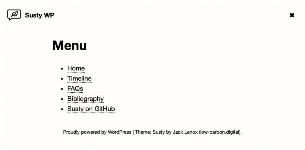
For example, let’s take a look at another work in the “less-is-more” category, named Susty: written by Jack Lenox, this theme tries to output the smallest page possible in order to reduce the carbon offprint of the content, keeping the payload to under 7kb.

A screenshot of "Susty" wordpress theme.

It’s a cleverly written theme, taking in consideration some issues (like additional power consumption by using multiple CDNs, or the impact on readability on low brightness displays for the overall design) usually ignored in most commercially-deployed theming solutions.

So, you may be wondering, where am I going with this? I’ll preface I’m nowhere near that smart to attempt writing anything comparable to the previous two projects, but taking the previously aforementioned themes as inspiration I’ve written Cellula:  a full fledged WordPress theme consisting of a single .php file weighting 3.218 bytes in size (plus the mandatory, nearly empty 350 bytes style.css).  It supports comments, widgets and archives.

Please, consider Cellula just a proof of concept, as I wouldn’t recommend using it as your theme for any serious project. Still, there’s a lot to be drawn from a project like this: I was quite surprised to see that both widgets and comments required little if absolutely no customization from their respective builtin core calls to be integrated in a theme, or by how little CSS is actually required to give a decent appearance to a mostly-textual web page (widely confirming what http://bettermother***ingwebsite.com has always stood for in its expletive ridden tirade). Most WordPress features should work with little to no issues, even default Gutenberg blocks should render correctly.

Unfortunately, by the virtue (?) of not having a functions.php file it means I cannot implement any hooks, actions or filters during the initialisation part of the rendering loop. In practice though it only affects the copyright text in the footer, given that there is no way to add custom fields or additional widgets areas.

The minified code is available on github here; simply download the zip file and install like a regular WordPress theme.

Posted in webdev

From Zero to Svelte: writing Units in Svelte and SvelteKit

A few days ago I published units, a simple CSS units converter written in javascript. When I started working on it a few weeks ago, I had just two main objectives:

  • building a CSS units converter closer to my tastes compared to what’s already available online;
  • finding a framework that would let me develop my ideas quickly enough to not get bored with them.

First point is rather straightforward: most online css converters around are rather clumsy, not particularly appealing, and more often than not full to the brim with ads and spyware. Jury is still out if units is any less clumsier than the alternatives , but at least I can assure you there are no obnoxious ads or tracking cookies outside of a single google tag. I can reasonably guarantee that it will stay like this for the foreseeable future.

Second one is… a bit tricky to explain.

Thanks to a combination of ADHD, having a full-time job, and me definitely NOT being a so-called 10x developer (more like, 0.75x) I was looking for a platform that would check the following boxes for my personal projects:

  • Quick to iterate;
  • Manageable to work with in small time chunks;
  • Reuse my current dev skills as much as possible (probably the hardest requirement to match)
  • Modern, still supported and with a large community behind it.

I wasn’t too focused on the specifics of the platform – this was mostly an exercise in getting out of the pit of WordPress Development Hell, which takes the most of my Dev Work Hours™ and sanity. Some other candidates included Swift (neat language and extremely solid UI options for desktop and mobile, but too far exotic compared to my current skills to be able to quickly build anything outside of a few demos), Laravel (amazing, full fledged platform for basically anything web-related, definitely an overkill for the scope I had in mind) and Next.js/React (whose previous exposure I had trough WordPress Gutenberg Blocks truly made me grow a distaste for the entire ecosystem).

On the other hand, Svelte and SvelteKit came out from this trial surprisingly close to my idea of “perfect“ platform: moving into it is extremely straightforward for anyone with basic experience with modern javascript, and the reactive libraries and additions to the language for state management felt like an actual semplification of the development process, rather than additional constrictions around vertical abstractions like Redux or MobX. Also – I know this is considered controversial is some developer circles – the decision to store a full component (style, code and UI) inside a single .svelte file is a godsend if your ADHD causes you to constantly lose your plot jumping from one file to another.

There’s quite a bit more to Svelte than this, of course. A more in-depth analysis of Svelte and Sveltekit this 2023 blog post by Claudio Holanda fully matches my experience with the framework, expressing it way better than I possibly could.

So, here’s a few tidbits on writing Units: from idea to completion it took roughly 40 hours, spanning around 4-6 weeks, usually spending no more than 2 hours per day (often way less), including learning Svelte and SvelteKit. The UI was built using Tailwind and Flowbite, both of which I had already sone experience with. After a quick comparison between hosting solutions available specifically for sveltekit, the choice fell on Cloudflare Pages and their generous free tier.


Within the extremely narrow set of self-imposed requirements I had come with Svelte performed admirably. Sure, a better developer than me would’ve fared better and faster with something a lot more clever like Elixir/Phoenix or Elm (but I’m definitely not that developer), and some of the alternatives I’ve tested deserve another chance (Swift especially), but in the meantime, I’m quite confident that Svelte will be my first pick for any web-based project in the future.